

In a world constantly chasing louder prints and brighter shades, there is quiet magic in restraint. Subtle colour stories in clothing hold a power that doesn't seek attention, yet commands it through calm confidence. These hues don’t arrive with fanfare - they drift in gently, inviting pause, reflection, and ease.
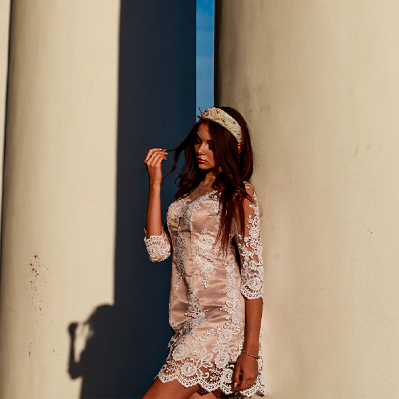
Subtle tones are more than just an aesthetic decision; they are emotional landscapes. Colours like soft sand, foggy blue, warm clay, moss green, and dove grey do not compete with the wearer - they complement. They don’t cover - they reveal. And in doing so, they unlock a form of style that is both grounded and elevated.
When serenity is the goal, colour becomes the language. Each tone whispers rather than shouts, creating compositions that feel lived-in, intimate, and timeless. A soft oatmeal kurta, a blush-toned shirt, or a muted indigo tunic doesn’t just cover the body - it calms the spirit. There’s a rhythm in such palettes, an intentional slowness that balances the noise outside.
Wearing such colours is a mindful act. It reflects an inner state, or perhaps a longing for one. While vibrant tones might dazzle for a moment, understated shades linger - they stay with you. Their neutrality isn’t lacking - it’s depth. And their subtlety isn’t plainness - it’s poise.
Texture plays a vital role in this conversation. A linen shirt in ecru doesn’t look the same as a cotton one in the same tone. The texture refracts light differently, adding dimension to what might otherwise appear one-note. Similarly, a tonal co-ord set in slate blue, finished in a matte fabric, exudes an entirely different emotion than if it were glossy. The fabric breathes colour in unique ways - absorbing, reflecting, softening, or deepening its presence.
Layering neutral or low-intensity hues allows even more expression. Think of a barely-there beige tunic over a pearl white inner layer. The blend doesn’t scream duality, yet it speaks of nuance. Subtle contrasts between two peaceful shades can communicate volumes. It’s elegance not forced, but felt.
These quiet colour stories also offer versatility. They move effortlessly across moods, occasions, and environments. A dusty pink tunic that feels calming during the day transforms under warm evening light into something romantic. A faded olive co-ord feels grounded in nature, yet sharp in a structured silhouette. These tones adapt - not by changing - but by resonating.
Culturally, there’s long been a reverence for soft palettes. They reflect clarity, humility, and depth. Such hues have adorned rituals, everyday living, and moments of stillness. In bringing them into contemporary fashion, one doesn't reject the present - they enrich it with history, rootedness, and a quiet kind of grace.
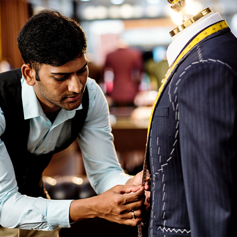
Design in this palette must be purposeful. When colour takes a step back, every line, fold, and stitch becomes the focus. The cut must carry the garment. The fall of the fabric must be intentional. The simplicity of the shade invites closer attention, asking the wearer and the onlooker to slow down, observe, and connect.
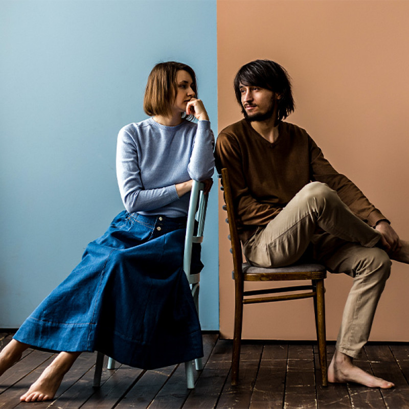
There’s also something deeply inclusive about subtle tones. They don’t demand a certain body, complexion, or presence. They wrap themselves gently around whomever wears them, enhancing rather than overshadowing. A well-tailored kurta in soft grey doesn’t try to alter - it amplifies what’s already there.
This kind of wardrobe is not just about looking composed - it’s about feeling composed. It’s a mirror of inner balance. In times when external chaos is common, dressing in calming tones becomes an act of resistance - of choosing harmony. The act of reaching for that mist blue shirt or the clay-toned tunic becomes a way of saying: I choose calm.
It’s easy to mistake quiet colours for lack of personality, but that couldn’t be further from the truth. These are shades of strength. Their very refusal to scream makes them powerful. In a world of fast-changing fashion and fleeting palettes, they remain grounded, intentional, and quietly striking.
Ultimately, capturing serenity through subtle colour stories is less about what others see and more about how one feels. These colours don’t need an audience—they need presence. They aren’t passing trends - they’re steady companions. And perhaps that’s their truest form of beauty.