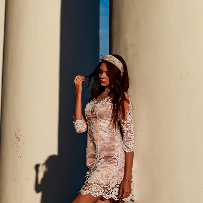
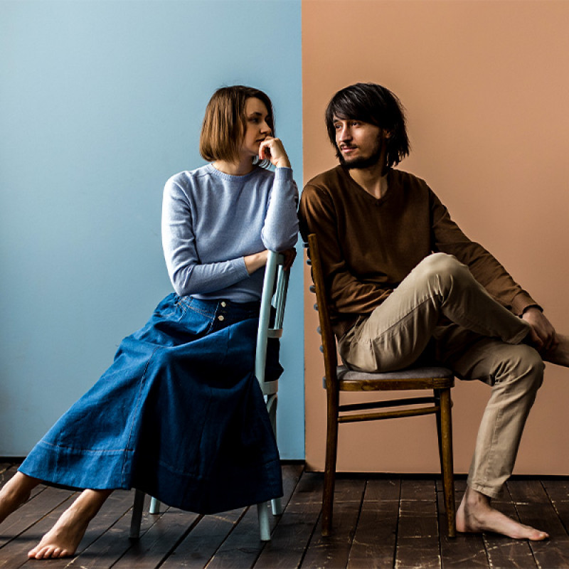
Colour isn’t just seen; it’s felt. It lingers in memory, shapes perception, and silently tells the world who we are before we speak. The clothes we choose each morning hold more power than we often realise. In their folds lie fragments of mood, energy, and unspoken emotion. When hues and harmony align, dressing becomes more than habit - it becomes intention.
Each day carries its own emotional palette. There are days when light pastels soothe the spirit, when ivory and sand feel like a gentle exhale. Other days demand the richness of deep ochres, forest greens, or stormy blues - tones that ground, strengthen, and anchor. Matching hues to mood isn’t about being predictable; it’s about being present.
The wardrobe becomes a canvas where psychology meets textile. Colours like rust and burgundy often evoke warmth and confidence. Shades of grey, when chosen with care, don’t dull - they distill clarity. White clears the mental slate, allowing space for quiet focus. Earthy tones like olive and taupe wrap the body in calm. The link between what we wear and how we feel is intimate and immediate.
Daily dressing, when done with colour in mind, becomes a tool for emotional alignment. Starting the day with a thoughtfully chosen hue can recalibrate mood and reinforce the tone we want to set. For instance, a misty blue kurta might soften an otherwise busy day. A structured black shirt might offer the confidence needed for a crucial conversation. This isn’t about fashion - it’s about flow.
In a culture rich with textile history and regional craft, colour takes on even deeper significance. The way natural dyes settle into cottons and linens, the way they fade with time, the way they echo the rhythm of seasons - all of it adds depth to how we dress. When hues are chosen not just for trend, but for temperament, garments start becoming second skin.
Matching hues also allows room for identity to breathe. Monochrome dressing brings clarity. Tonal layering tells a story of nuance. Contrasts - when thoughtfully chosen - create dialogue, not conflict. There’s poetry in pairing. A dusk-toned tunic with a charcoal overlay. A blush-toned kurta with almond-toned trousers. The more intentional the hue, the more compelling the whole.
What we wear becomes an invitation. It invites us to be more attuned to our own emotional terrain. A person who instinctively reaches for muted tones might be in a season of quietude. Someone favouring bold hues could be craving assertion or joy. Matching hues is not about rules, it’s about reflection.
Even the texture of a fabric influences how the colour behaves. A maroon on brushed cotton feels different from the same maroon on crisp poplin. The same shade on linen carries a lived-in ease, while on twill it feels more composed. It’s not just about what colour is worn, but how that colour lives on the fabric.
And then there’s rhythm - how colours move with us through the week. Lighter hues for slower mornings. Darker tones for focused evenings. Mid-tones for those in-between days that demand both presence and patience. Once colour becomes intuitive, the closet becomes a language, not a storage space.
This conscious relationship with hue leads to better buying habits. Instead of chasing novelty, we begin to curate based on need, feeling, and versatility. That sky-toned shirt isn’t just pretty - it lifts the mood on grey days. That sage green kurta doesn’t just look nice - it steadies the spirit during chaos. Pieces become purposeful.
In truth, mastering moods through hue is about harmony - between self and season, between fabric and feeling. It’s about showing up in clothes that honour how you feel, not override it. It’s also about balance: using colour not to distract, but to express. Not to impress, but to articulate.
The beauty of clothing lies in this silent dialogue. One doesn’t need loud prints or elaborate patterns to stand out. A deep plum shirt on a quiet morning, a crisp beige kurta during reflection, a slate-coloured co-ord set for clarity - each carries its own strength. All speak softly, but clearly.
Matching hues, then, is less about coordination and more about connection. It’s the mindful moment where the mirror meets mood. And when we learn to read ourselves through our colours, dressing becomes less of a task and more of a ritual - a daily act of quiet self-acknowledgement.


